Scotus' Great Primer Roman
A 'Helvetica' of the Renaissance
PHS 50th Anniversary, St Bride, 13 November 2014
In November 2014 I gave talk in London about my research, still in progress, on the most widely used roman type of the Renaissance. We find it in books printed all over Europe for more than a century.
This type was noted by Carter and Vervliet but they did not realized how widespread it was.
It was used by Josse Bade in Paris in the early 16th century. I have found it in Erasmus’ famous books printed in Basle by Froben. Some 30 years earlier Ratdolt displayed it in the first specimen of movable types (1486) and later Aldus used it for his first Greek–Latin grammar (Lascaris, 1495)… The list could go on for many pages.
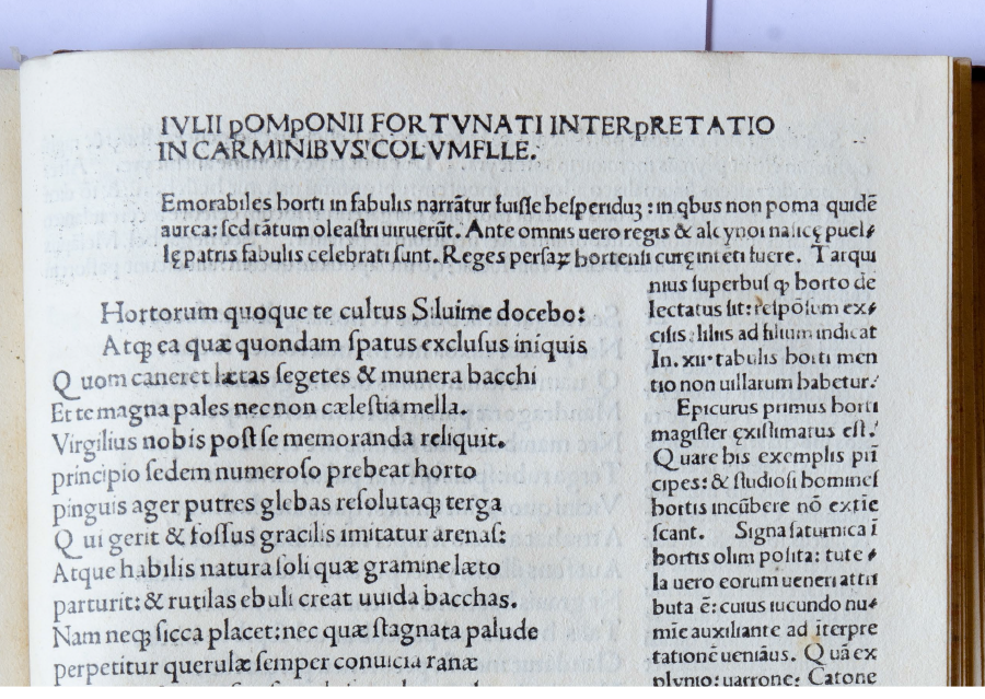
 The Scotus' Great Primer Roman employed in the Greek grammar of Lascaris (Erotemata) printed by Aldus, Venice, 1495.
From my research to date, I can say that this type was used by more than a hundred European printers from 1480 until at least 1570s and I am certain that many more still await discovery. I have found it in Venice (where it was probably cut), in most northern Italian towns, and also in Florence, Rome, Naples and Messina, Spain, France, Switzerland, Germany, the Low Countries and perhaps Austria too.
Its first appearance seems to be with Ottaviano Scotus’ printing press in 1481 and in a few years it became extraordinarily widespread: it was used by almost thirdy printers before 1490. Remembering the printer who first employed it, I call this type the Scotus Great primer roman.
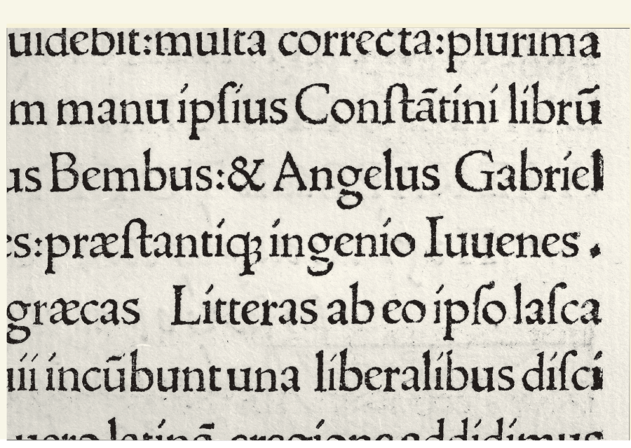
 The Scotus type in an unassigned and undated Columella [Venice about 1481-82], with a descending capital P, very uncommon in Roman type.
With the help of macro photography and analysis of the enlarged letters, the aim of my research is to map the spread of this type and also the changes made to it throughout the century. During its long life the Scotus Great primer roman has undergone many additions and much recutting (especially of lowercase letters) and is sometimes very difficult to recognize.
I am sure that mapping the distribution of this type and the relations among printers will tell us more about political connections and European trade during the 16th century.
 Lowercase i: a relevant detail of the Scotus type is the í with a stroke instead of the dot.
Due to copyright issue (the pictures are subject to copyright of the libraries that conserve the books) I cannot publish the pdf presentation of the talk. If you are interesting in it, please contact me.
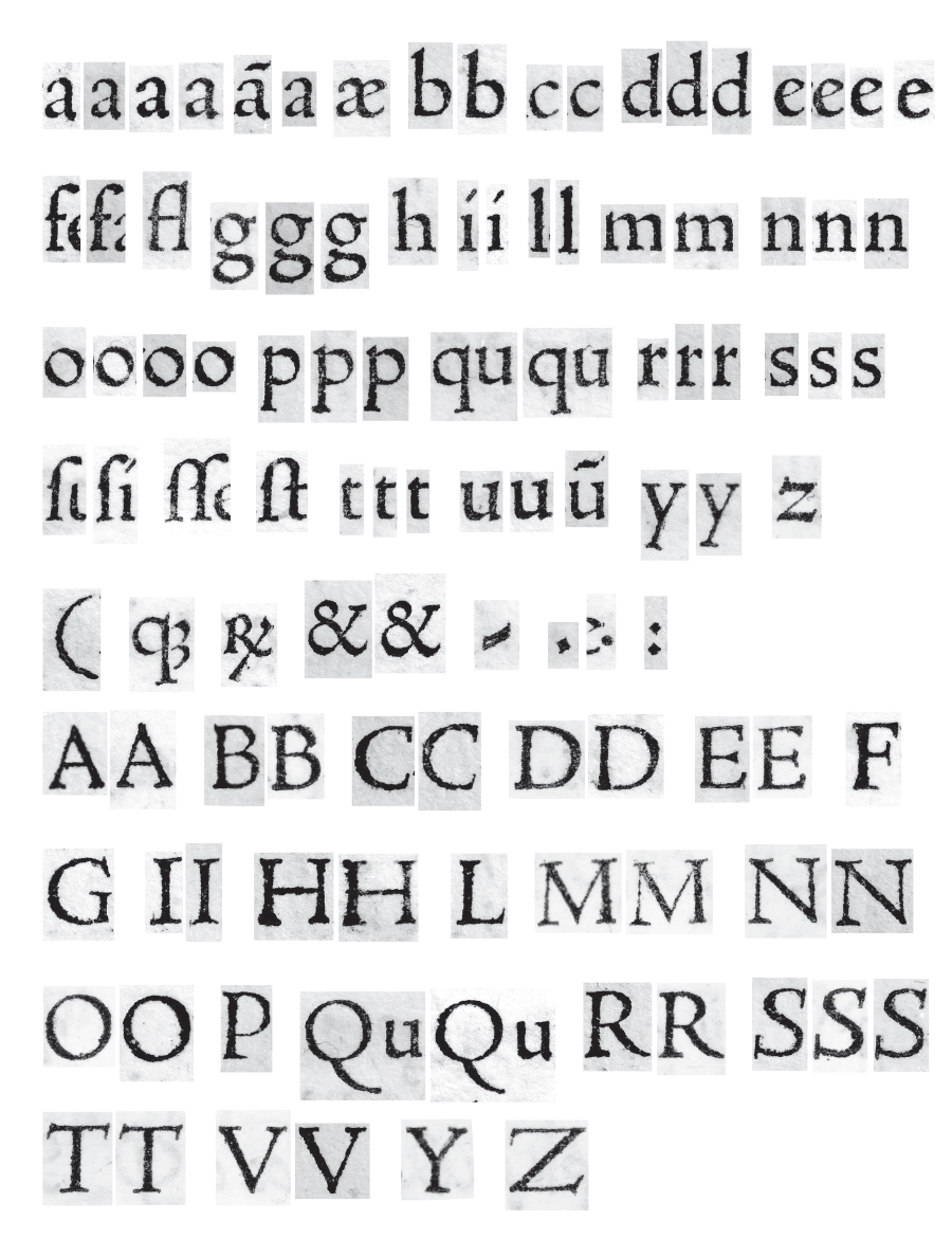 The complete synopsis of the Scotus type taken from Aldus’ Lascaris.